Powered by Blogger.

Followers

RSS

Pages

Main Task: Profiling your audience part 1

Age: 16- 21 age group as it would be mostly modelled towards this age group

Class:  Lower to middle class. I believe in my own opinion, its high unlikely that a upper class person will found interest in the music magazine I am due to produce in the near future because of the informal language used in typical music magazine genres such as mine. And also because of the non music topics it covers.
Music Interest:  Predominately Hip hop but any kind of genre related to hip- hop or affiliated to this genre. For example, rhythm and blues goes well with hip-hop and rock and hip-hop have also been known to go well.
Ethnicity:  This not an issue or a target as I look to create a music magazine which appeals to people of different races. For example it would be stereotypical and racist to assume a black person would ultimately be a fan of hip-hop music and culture simply because of his skin colour.
Gender:  Male or female depends on the individuals taste on music which I am looking to cover in my magazine. For example I am looking to cover mostly hip-hop music and that might be a problem for a male or female who does not like hip hop music but likes Rock or soft metal music.
Technology:   Likely to have a smart phone such as a Blackberry or an “I phone”. Also would have relevant computer skills and would use the internet a lot as a source of entertainment and a place to socialise with friends away from the physical world.  Would also maybe have a next generation console in there individual possession but that’s not a definite attribute as my magazine will not be around video games however I may include a part about video games such as a brand new game review, depending on the results I get back from my audience research.
This information above will help me produce my magazine because my ideal target customer will have the same attributes like me. Although we may not be the same ethnicity or gender, we would like the same things, be the same age roughly and be from the same background. This and my audience profile will let me know what to include in my magazine to appeal and attract a higher readership in my target audience. Bearing that in mind my customer profile and my audience profile results my be different to each other because of the fact the audience research is normally research collected by a website based on there readers opinions about particular topics and there respective personal life

  • Digg
  • Del.icio.us
  • StumbleUpon
  • Reddit
  • RSS

Main Task:Further Research

I wanted my music magazine to be much better than my college magazine so i researched on youtube, tutorials that will help me understand the more advanced stuff in photoshop


  • Digg
  • Del.icio.us
  • StumbleUpon
  • Reddit
  • RSS

Main Task: Textual Analysis of a Music Magazine double page spread

Textual Analysis of a Music Magazine Double Page Spread


Denotation: The double page spread consists of a colour photograph of a young woman with her hands on her hip in a very peculiar posture. Her hands on her hip could connote her frustration or anger towards any particular subject. The camera shot is a medium long shot which lets the reader or the viewer know that she is clearly standing in the photo. The background behind her is white which may lead to confusion because the reader could be very well unsure where the photo of the girl was taken. The anchorage in the double page spread interview is black and white, while the quote on the double page spread is white with black shadow lining.
Anchorage: The text in the quote is sans serif which would usually connote lack of formality or seriousness however the quote in the double page spread says different. “People think I’m an attention seeker but I’m just honest” shows the woman (known as lily Allen) feelings and is used to grab the reader’s attention because they may look at the quote and think what she is talking about or who is she referring to? Many magazines include quotes on there double page spread to grab the reader’s attention and make them subconsciously feel the urge to purchase the magazine in order to read the ‘exclusive’ interview.
Page Photograph: The photograph is of a famous British singer called Lily Allen. Her Non verbal communication is very relaxed which is unusual because of the subject matter in the interview. Her clothing is very modern which could imply she follows the latest trends because of the career she follows.
Setting: The setting is ambiguous because the viewer looking at the page would be unclear about where the photo was done because of the high-key lighting used in the photo. The brightness of the photo could connote juxtaposition because of the topic of the subject in the interview. From the quote it’s clear to the reader that the topic is about Lily Allen’s frustration or anger towards a subject matter. Thus it’s a juxtaposition because the brightness of the photo connotes a sense of peace and tranquillity while the quote ( which is cleverly covered in black ) connotes a lack of empathy and hollowness.     

  • Digg
  • Del.icio.us
  • StumbleUpon
  • Reddit
  • RSS

Main Task: Textual Analysis of a magazine front cover


Denotation: The front cover consists of a colour photograph of a man with his eyes closed and a gun pointed at his chin. The hands on the gun connote his frustration at life while his closed eyes connote a sense of fear of death. The camera shot is a close up and to some sense to a brand new reader may connote the man in the front cover closeness to giving up in his life or what ever career he does. The background of the magazine front cover is grey which is a very dull colour but this could be due to the male in the front cover.
The colours of the anchorage is red and white and the barcode is placed in the lower left corner, with the date of the magazine publish date on top of the barcode.
Anchorage: All text on the front cover is in serif font which could connote the importance of the issues in the magazine. All the text is also bold which also connotes the importance of maybe the content of the magazine or the editor himself. From the text on the magazine front cover, we work out the man on the front cover’s name is the game and that suicide is not opinion for him. These may be due to the fact of the music that he does or the lifestyle he lives by. To a subscribed reader they would know that he is a rapper and that his lifestyle and the music he produces connotes his consistent work rate thus the term ‘suicide is not an option’  has a deeper meaning and implies that he wont give up on his music or maybe even his own loyal fans. The colour of text on the front cover is in some sort of juxtaposition as the colour white connotes a sense of peace and tranquillity while the colour red connotes a sense of violence or murder.
Masthead: The masthead is ‘The Source’ which connotes the exclusiveness of the magazine and its contents. The masthead colour is a very strong red which usually would connote a sense of danger or violence however the editor may have made the masthead red because of the attributes it may have with the games lifestyle. Before becoming a rapper, The Game was a part of a large gang called the ‘pirus’ also known as ‘bloodset’ located in south central Las Angeles; A gang famous across the globe for wearing mostly red outfits and having disputes with another gang called the ‘crips’ , a gang famous wearing mostly blue outfits. Thus the editor may have made the masthead and most of the text red so that it may give the reader a subconscious hint of what the interview or the issue may be because it may include a part about his life story or the dangers he faced growing up in LA.
Cover Photograph: The photograph is of The Game. His posture is very uptight and cautious which could connote his awareness of his enemies or his vulnerability in letting strangers into his personal life. His clothing is a quite basic (a grey top) which connote his rise to the top in terms of finance or music or it could connote that he is trying not to forget about his humble past.
Main Coverline: The text in the main coverline is red which could be the case because of The Games previous lifestyle. The text very well relates to the magazine main photograph because it says ‘THE GAME, Suicide is not option’ and the photo consists of the game in a very suicidal position.
The other cover lines tells us and lets the reader the know that this magazine is a music magazine and that it also a rap magazine only but also that includes other things associated with the genre of music such as games and festivals . The artists on the front cover mentioned are:   Plies, Cool kids and many more, which give the reader an indication that magazine focuses manly on famous rappers of the American kind. All the text in the magazine front cover is in bold which could connote the magazine eagerness to develop a stronger readership .
Colours:    the colours on the magazine front cover are very basic and dull; Red and White which could connote the humble beginnings of the editor behind the magazine and his team.       
From the above analysis of this magazine it is very clear to me that the magazine target audience is that of mostly males who are in there late teens to the early 30s. They are likely to be big fans of rap music and have a good knowledge of the music genre itself. They may not be well educated or they may, that part of analysis is very ambiguous due to the content displayed on the magazine front cover.

  • Digg
  • Del.icio.us
  • StumbleUpon
  • Reddit
  • RSS

Main Task: Introduction

Now that i have finished my preliminary task of creating a college magazine, i am going to now move on to my main task for my AS media coursework. This task consists of making a music magazine front cover and double page spread based on research i obtained from people in my audience research

  • Digg
  • Del.icio.us
  • StumbleUpon
  • Reddit
  • RSS

Product Evaluation

Task 1.
My first set of tasks for my Media coursework was to create a college magazine font cover and contents with information gathered from my audience research. But before any of this happened I had to know how a typical college magazine front cover looked like. So for my first task I analysed a college magazine front cover and wrote about how its features let the reader know it’s a college magazine and not any other type of magazine. Unfortunately, the first college magazine front cover I analysed was an American football magazine so I had to do the dreary task again. Fortunately, this time I got the college magazine genre right.  
  Here is the college magazine front cover I analysed as evidence of this I have included a couple I wrote in my essay.
(Textual analysis in bold and italic)


‘Denotation: The Magazine Front Page is an photograph of an young caucasian male looking bamboozled with his two separate fingers up. The two fingers look as if they creating a electric shock which connotes that the magazine is vibrant and entertaining. The Bright colours used in the magazine front cover create an impression that the magazine will appeal mostly to the younger generations ( i.e teenagers). Also in the photo the male’s eyes look dismayed which connotes that he may be confused by power sourced from his two fingers. He is in the front of a black background. The magazine seems to made for both male and female even though there is only a male figure on the front page.
Anchorage: All text on the magazine front cover is not serif font which conotes the lack of formality or the relaxed apporach the editor of the magazine may have inisted on. Text on the magazine is mostly in a mixture of blue and white- two colours miles apart on the colour wavelength, which could connote the unusuality of magazine and its intended target audience. Text in some aspect seems to create an impression of being airbrushed which could connote a theme of rebellion from the magazine editor point of view.
Masthead: The masthead of this magazine is in an big bold font, which connotes the confidence or lack of it on the magazine editors behalf. The large masthead also attracts the reader to the unusuality of the magazine and the lack of formality. The word ‘Reverb’ is very informal and it purpose is very ambigious.’
Overall I found that this was a time consuming because of the fact I had to redo it. However a strength of this assignment was that it helped me know what a college magazine looked like in greater detail.  A Weakness of this assignment was that it was very time consuming and tedious at times due to the fact that I had to redo it. After Mrs had given me relevant feedback on the task I uploaded to my Blog.
Task 2
After I had finished my textual analysis, I prepared a questionnaire with 20 questions in preparation for my magazine. I handed out 20 questionnaires to students in my college. From the answers I received from the questionnaire, I took them in consideration and use part of the data to produce my magazine front cover and my contents page.
   Media Studies Questionnaire
This questionnaire is being filled in preparation for my first ever magazines publish in a couple of weeks. I am doing this questionnaire for evidence of student
(Please tick beside the appropriate one)

Q1)   How old are you?
·         16
·         17
·         18
·         19
Q2) What Gender Are You
·         Male
·         Female
Q3) How much would you pay for a magazine?
·         50p
·         £1
·         £1.50
·         £2.00
Q4) what kind of topics would you want to be in the magazine?
·         College life
·         Pastoral Help
·         Music
·         Film
A strength of this task was that it was quick and the data I received helped me to make my magazine front cover. Also it was very easy to upload to ‘Blogger’ as it only was text. A weakness of this assignment was when I received answers back I felt that maybe the people were a bit biased because many people picked the same answers, when it came to certain questions.
Task 3
Subsequently from the answers I received in the questionnaire I put the corresponding data into different bar graphs to help with my next task; ‘Audience research Graphs’
Here are a couple examples of the graphs I produced from the data I received from my questionnaires.


The different colours in the pie chart represent the different answers I received in this particular question.

For my last question I was unable to produce a graph because of the openness of the question.  A Strength of this task was that it helped me make my audience research evaluation much easier. A weakness of this task was that it was very time consuming when I uploaded it to my Blog because I could only upload one graph at a time.  

Task 4
After I had finished producing my graph charts I produced an audience research evaluation to evaluate all that I did in my audience research.  Underneath is an extract from my audience research evaluation
Question 1: How old are you are?
This question was firstly used as a starter question to discover the ages of people and see if there could potentially be a link between the popular age and there answers. For example, will certain age groups like different things? For this and all the questions I used a pie chart because I felt that this chart was the best to use as it is very statistical.
 Of the 20 people used in my questionnaires, a staggering 60% were 17. This promptly let me knew the popular age of the questionnaire. 6 people were 16 years old while 2 people were 18. The questionnaire was distributed to mostly random around college so there was no bias used.
This task on a whole was very time consuming as it took long to upload to Blogger and it was a very long assignment to write 
Task 5
With all my research and analyses done, it was now time to take the relevant pictures for my magazine front cover and contents page. Underneath are examples of pictures I took; 
This was used on my magazine front cover


This was used in my contents page


Overall, this task was not time consuming at all because of the fact I was able to obtain my photos in a matter of minutes. It was also my first time using a professional camera which at first was difficult to use because of my lack of experience however the more and more I used the camera the less difficult it was to use.

This is the camera I used when I was taking photos. It is a Canon EOS 400D.


Task 6
With my photos taken and approved by my teacher, I began to make my magazine front cover. This task took a couple of lessons to do because of my lack of experience with the software, Adobe Photoshop CS3. However I found this task to be very enjoyable because it was fun in my opinion to create a magazine front cover which included people you knew.
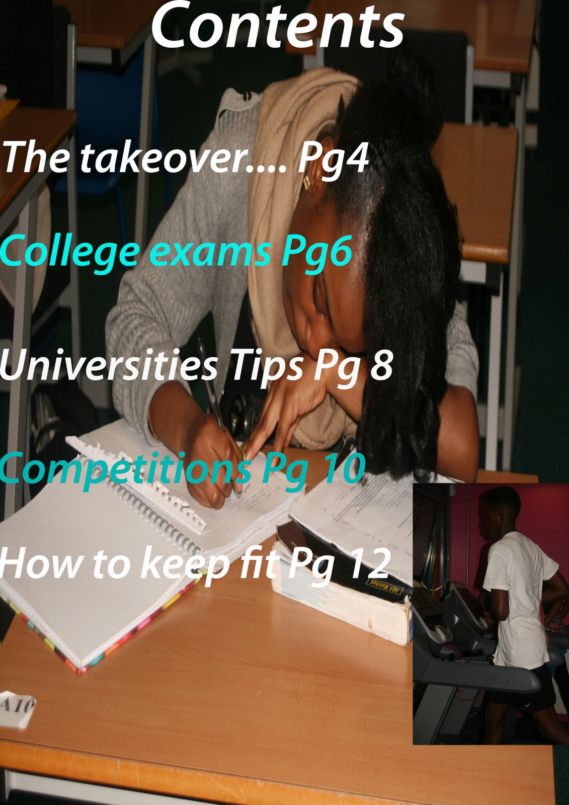
Task 7
After I finished my magazine front cover, I began work on my contents page. In all honesty I did not enjoy making my contents page because I felt that it was below standard. It only took me half a lesson to make which in all fairness is not enough to produce an acceptable piece of creative work in media. Underneath is the dreaded piece of work I call an contents page.


  • Digg
  • Del.icio.us
  • StumbleUpon
  • Reddit
  • RSS

Final Product Contents Page


  • Digg
  • Del.icio.us
  • StumbleUpon
  • Reddit
  • RSS

Final Product Front Cover

  • Digg
  • Del.icio.us
  • StumbleUpon
  • Reddit
  • RSS

Photographs


  • Digg
  • Del.icio.us
  • StumbleUpon
  • Reddit
  • RSS